Renders a 2D ggplot of a classification decision boundary, optionally overlaying
observed training data. Input must be a classbound object that has already been
passed through boundary_compute().
Usage
plot_boundary(
  model,
  obs_data = NULL,
  x_col = NULL,
  y_col = NULL,
  true_label = NULL,
  facet_col = NULL,
  type = "2D",
  show_gradient = FALSE,
  agree_color = "#006666",
  disagree_color = "#FF8000",
  obs_alpha = 1,
  obs_size = 2.5,
  render = c("raster", "tile"),
  colors = NULL,
  palette = NULL,
  highlight_outliers = FALSE,
  xlim = NULL,
  ylim = NULL,
  ...
)
Arguments
- model
A
classboundobject returned byboundary_compute(). Must contain boundary data in$boundary_data.- obs_data
An optional data frame of observations to overlay on the boundary plot. Typically the training data. If provided,
x_col,y_col, andtrue_labelare required.- x_col
Column name in
obs_datafor the x-axis feature. Used as the x-axis label. Required whenobs_datais provided and the model has no projection.- y_col
Column name in
obs_datafor the y-axis feature. Used as the y-axis label. Required whenobs_datais provided and the model has no projection.- true_label
Column name in
obs_datacontaining the true class labels. Required whenobs_datais provided.- facet_col
Optional string naming a column in the boundary data to facet the plot by. Set to
"model"automatically when the input is a multi-model comparison object. Also compatible with any column fromboundary_workflow_set()output.- type
The visualization type.
"2D"(default) renders the predicted class regions."disagreement"renders a binary map showing where models agree vs. disagree; requires a multi-model input.- show_gradient
Logical. If
TRUE, decision regions are shaded by the predicted class probability (requires a classifier that provides probabilities). Defaults toFALSE.- agree_color
Color for regions where all models agree (only for
type = "disagreement").- disagree_color
Color for regions where models disagree (only for
type = "disagreement").- obs_alpha
Numeric transparency for overlaid observation points (0.0–1.0). When a projection is active, this is treated as the maximum opacity; actual alpha varies by depth-fading.
- obs_size
Numeric point size for overlaid observations.
- render
Rendering method for decision regions:
"raster"(default, fast, not plotly-compatible) or"tile"(slower, compatible withplotly::ggplotly()).- colors
Optional named character vector mapping class labels to colors, e.g.
c("Adelie" = "#E6194B", "Chinstrap" = "#3CB44B", "Gentoo" = "#4363D8"). Overrides bothpaletteand the defaultclassbound_palette().- palette
Optional RColorBrewer palette name (e.g.,
"Dark2","Set1") to override the default colors. Falls back toclassbound_palette()if the palette cannot support the number of classes.- highlight_outliers
Logical. If
TRUE, observations withis_outlier == TRUEinobs_dataare rendered as diamonds (shape 23) instead of circles.- xlim
Optional length-2 numeric vector to set x-axis limits.
- ylim
Optional length-2 numeric vector to set y-axis limits.
- ...
Additional arguments (currently unused).
Details
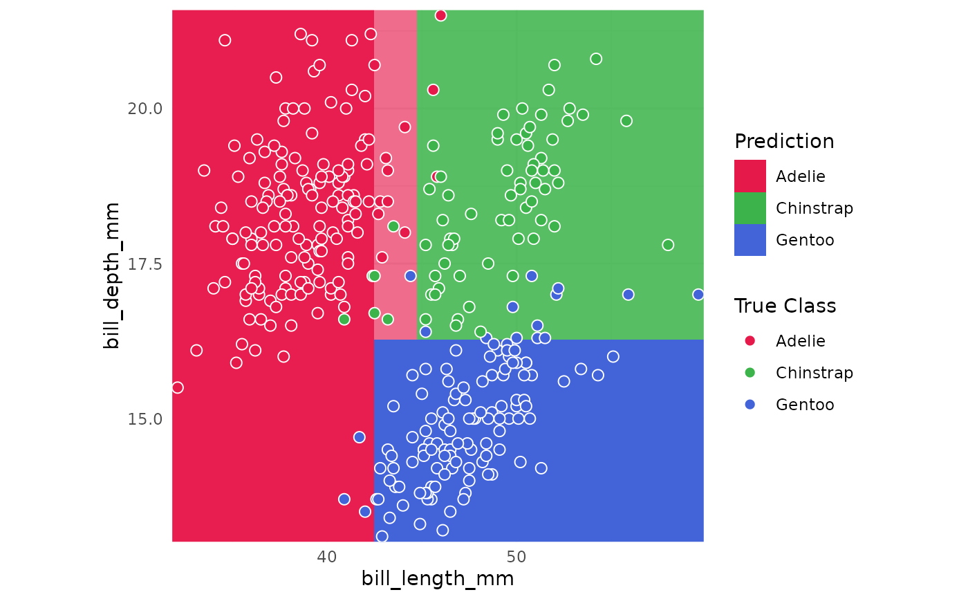
Probability surface (gradient)
When show_gradient = TRUE, decision regions are shaded by the predicted class
probability: deep, saturated regions indicate high model confidence, while faded
regions indicate uncertainty near the boundary. Probability shading is only possible
when the underlying classifier returns class probabilities. Classifiers that return
only class labels (e.g., standard SVMs or PPtree models) produce a flat boundary
regardless of show_gradient.
High-dimensional projections and depth fading
When the classbound object contains a projection (from boundary_compute(..., projection = ...)),
plot_boundary() automatically forward-projects any obs_data observations onto the
2D plane. It also computes each point's orthogonal distance from the projection plane
and maps this distance to opacity: points lying exactly on the plane are fully opaque
(alpha = 1.0), while points further away in the original feature space gradually
fade toward alpha = 0.2. This depth-fading provides visual cues about how faithfully
each point's position is captured by the current projection.
Rendering backend and plotly compatibility
The default render = "raster" uses ggplot2::geom_raster(), which is fast and
produces high-quality static output. However, geom_raster() is not supported by
plotly::ggplotly() and will produce a blank interactive plot. To convert a boundary
plot to an interactive plotly figure, use render = "tile" instead:
p <- plot_boundary(model, render = "tile")
plotly::ggplotly(p)
Colors and palettes
By default, plot_boundary() uses classbound_palette(), a curated 20-color palette
with deterministic (alphabetical) class-to-color assignment, ensuring consistent colors
across multiple plots. Supply a palette name (e.g., "Dark2") to use an RColorBrewer
palette, or supply colors as a named vector for explicit control. If an RColorBrewer
palette cannot accommodate the number of classes, it falls back to classbound_palette().
Examples
# \donttest{
library(palmerpenguins)
data(penguins)
peng_data <- na.omit(penguins[, c("species", "bill_length_mm", "bill_depth_mm")])
m <- fit_model(peng_data, species ~ ., rpart::rpart)
m <- boundary_compute(m, resolution = 50)
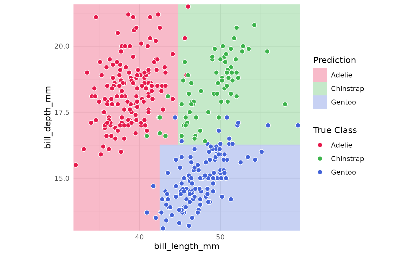
# Basic boundary plot with observations
plot_boundary(m,
obs_data = peng_data,
x_col = "bill_length_mm",
y_col = "bill_depth_mm",
true_label = "species"
)
 # Probability gradient (rpart supports probabilities)
plot_boundary(m,
obs_data = peng_data,
x_col = "bill_length_mm",
y_col = "bill_depth_mm",
true_label = "species",
show_gradient = TRUE
)
# Probability gradient (rpart supports probabilities)
plot_boundary(m,
obs_data = peng_data,
x_col = "bill_length_mm",
y_col = "bill_depth_mm",
true_label = "species",
show_gradient = TRUE
)
 # Plotly-compatible rendering
p <- plot_boundary(m,
obs_data = peng_data,
x_col = "bill_length_mm",
y_col = "bill_depth_mm",
true_label = "species",
render = "tile"
)
# plotly::ggplotly(p) # uncomment to convert to interactive
# }
# Plotly-compatible rendering
p <- plot_boundary(m,
obs_data = peng_data,
x_col = "bill_length_mm",
y_col = "bill_depth_mm",
true_label = "species",
render = "tile"
)
# plotly::ggplotly(p) # uncomment to convert to interactive
# }